
Photographic composition is an expression of your innate sense of design. This guide can help you strengthen your inherent sense of composition and take better photos.
Table of Contents
Photographic Composition Guide (1): Concise
Simplicity is the most basic and most important principle: find ways to make your photo subject have the strongest visual appeal. One way is to choose a simple background, so as not to distract the audience from the subject.
Photo 1 (Text on the right: Phone? Bridge? Or cactus?)
Let’s take a look at how to improve this photo by simplifying the complex. First, decide whether the subject is a public phone, a bridge, or a cactus.
Photo 2
We decided to use cactus as the theme, move the camera closer, and use a flat sky as the background to simplify the picture and improve the effect of the photo.
Photo 3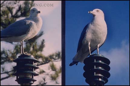
Of course we are close enough to the subject in the above two photos, but the background of the photo on the left is messy, covering the body of the seagull. Just move the camera’s angle of view a little bit, and the seagulls will stand out on the background of the blue sky.
Photo 4: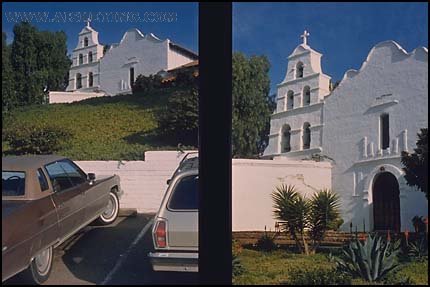
When composing the picture, you must clearly indicate your shooting intention, and arrange other objects outside the subject to make it a supplement to the subject. Most people will like the photo on the right because the parking lot under the photo on the left contradicts the antiquities of the theme ancient building.
Photographic Composition Guide (2): Rule of Thirds
When placing the subject outside the center of the screen, the rule of thirds can be used as a composition guide, as shown in the figure below
Photo 1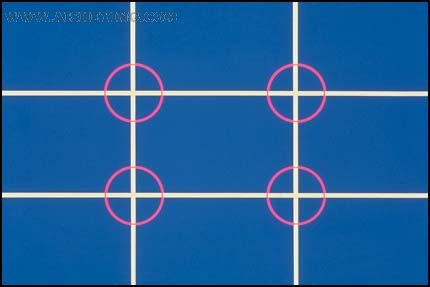
Before taking a picture, imagine dividing the entire picture into three equal parts vertically and horizontally to get four intersection points. This is where the subject should be in a good composition. Where to put the subject depends on the subject and how you want to express it.
Photo 2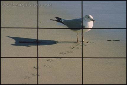
We place the subject at the upper right point so that we can show the shadow and the footprints that lead the vision to the seagull.
Photo 3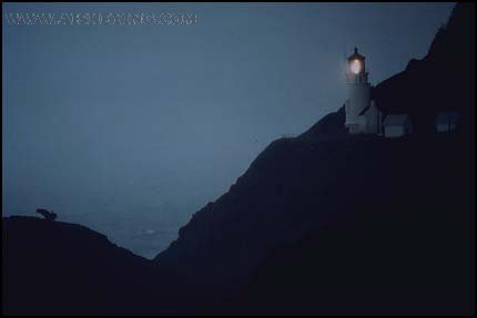
The lighthouse is located at the upper right point, because the trend of the rest is consistent with the layout of the screen.
Photo 4:
The theme is well controlled in this example picture. You can place the subject anywhere on the plank road. But according to the rule of thirds, the current position is the best. Moreover, this composition points out a clear path for the subject in the picture (thus creating a sense of distance and depth).
Photo 5:
In the case of the subject moving, the path problem must be considered. It is usually necessary to leave enough space in front of the direction of travel.
Photo 6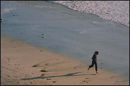
If you don’t do this, this is the consequence: the jogger seems to be going outside the photo.
Photo 7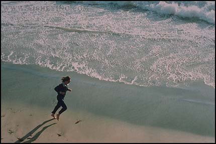
Placing the main body at the bottom left not only conforms to the rule of thirds, but also leaves enough space for the main body to move.
The Rule of Thirds in the Vertical Separation
Photo 8: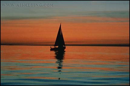
The rule of thirds can also be applied when the screen is divided vertically. The ship and the horizon in the picture above are in the middle, giving people a static and dull feeling.
Photo 9:
Let’s raise the horizon to the upper third and place the ship on the left. Remember, what I’m talking about here are just guiding principles. If you don’t like this composition, try another one.
Photo 10
Like this, lower the horizon to the lower third. Generally speaking, the horizon should be placed one third in the wind and light, and rarely in the center.
Photo 11:
Just as the horizon is best not to be in the middle, longitudinal objects are best not to be in the middle. For example, in the picture on the left, the longitudinal object is in the middle, while in the picture on the right, the photographer only moves the camera to get a more expressive picture.
Photographic Composition Guide (3): Lines
Lines play an important role in the composition. The sculpture has graceful lines, but the messy background obscures its characteristics. We tried to simplify the picture a bit and moved the camera to the bottom of the sculpture.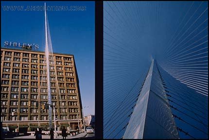
Now we can look up and find that these lines are set against the clear sky background. Because of the strong dynamic diagonal lines, the photo on the right is more expressive.
Imagine what happens if this photo loses the diagonal light? You might agree: the diagonal lines are more dynamic.
You can use the diagonal lines as a guide for the line of sight to enter the screen. This is a simple and easy way to make the viewer’s line of sight follow the line of guidance to the subject.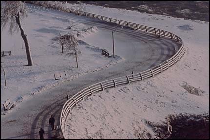
The most common and elegant line in the composition is the S-shaped line.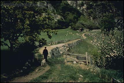
The S-shaped lines here also form a diagonal visual guide line, and the good position of the subject also enhances the photo a lot. The result of this composition is a compelling photo.
Photographic Composition Guide (4): Balance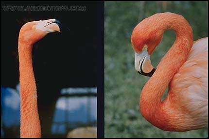
The photo on the right is what we want: the flamingo relaxes, the neck forms a pleasing S-curve, and the background is better. In photography, the S-shape is a very attractive form, which is worth looking for.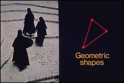
You can also use other geometric figures to help with composition. Can you see the triangle formed by the imaginary connection between the three nuns? It strengthens the overall sense of the photo.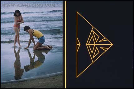
Please note how many triangles are formed by the pair of models and their reflections. Research and find out the power and balance of the lines and geometric figures in the picture to cultivate your artistic vision.
Balance is another principle for obtaining a good composition. Please note that the positions of the leaves, windows, and two models are just right. In order to obtain this balanced picture, the camera’s viewpoint and the position of the subject have been carefully arranged.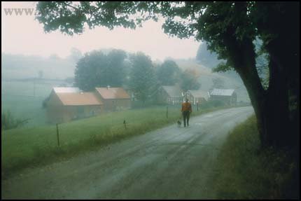
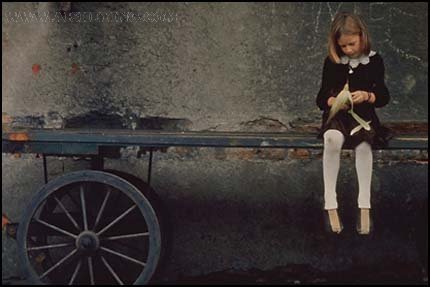
To master balance is to arrange the shapes, colors, and light and dark areas to complement each other and make the photo look balanced, rather than skewed to one side like this. Due to the lack of visual support in the photo, the little girl looked like she was about to fall out of the picture.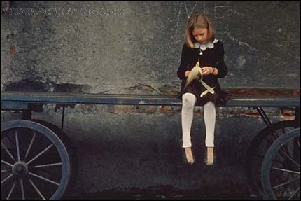
Now we adjust the camera’s angle of view to take photos of the wheels that are vital to support the subject. Although Karen is still off the center of the photo, the whole photo is balanced.
Photographic Composition Guide (5): Frame
No, this is not the framework we are talking about, although the principles are the same.
The frame we are talking about refers to the use of objects in the foreground to frame the subject. This can give the photo a sense of depth and make it different from ordinary snapshots.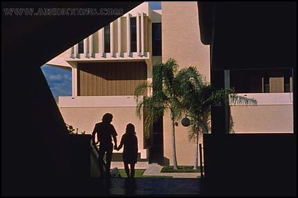
Whether to use a frame in a photo depends on the subject, and the subject of each photo is different. Of course, the objects you use as frames will not be the same.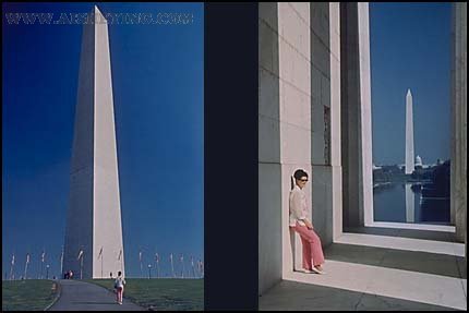
The Washington Monument in the photo on the left is located in the center without a frame, while the photo on the right clearly has a stronger sense of depth and a more complete picture language. This is entirely because the photographer has chosen a suitable foreground, which complements the monument well.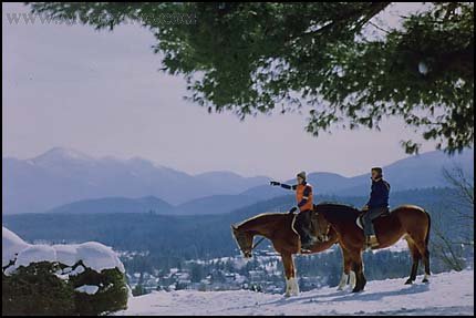
Horses and riders create a very flavorful foreground for the photos. The hanging branches complement the frame and add depth to the photos. When you use people for balance or as a foreground, make sure they face the center of the photo.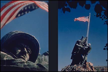
These two interpretations of the Iwo Jima battle commemorative sculpture effectively used the frame to add a sense of space and artistic conception to the photos.
No matter what subject you choose to shoot, be careful not to cover up the subject.
Photographic Composition Guide (6): Avoid Covering Up
Avoiding obscuration is the sixth principle for us to obtain a good composition. The tree above the man’s head is so obvious, you may think that no one will not see it before pressing the shutter. But remember: the way people view objects is three-dimensional, so in fact it is easy for us to stare at the subject and ignore the background.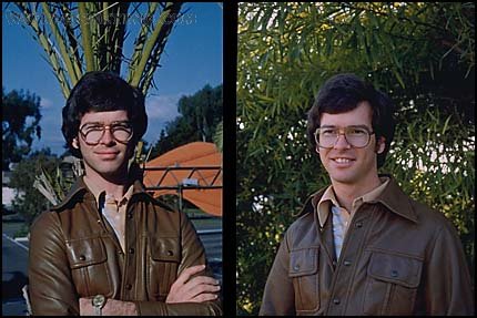
On the contrary, the camera always takes pictures of everything honestly. So before asking the model to pose, remember to find a clean background for him. In this case it is actually very easy to do this, the camera moved only a few feet when taking the left and right photos.
This is an interesting photo. But when we cut people in half or cut off their heads or feet, we made an “out of bounds” error. The reason for this problem is usually that the photographer’s eyes and the viewfinder do not cooperate well. When framing, be sure to keep your eyes straight and close to the viewfinder. Pay attention to adjusting the composition, leaving blanks on the four sides.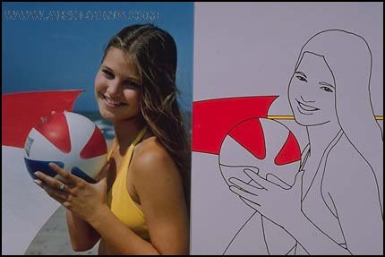
The distractions of proximity may not be that annoying, but they can still distract the subject. This interference means that certain objects and lines are too close to the subject. This is the case with the ball and umbrella side in this picture.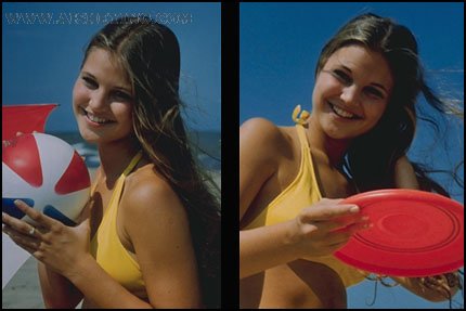
Let’s improve it with a low viewing angle. For simplicity, only the same props are used. Note that the frisbee should be far enough away from the model’s face to avoid interference. This is our sixth principle of composition.